The dynamic hue of Very Peri, the Pantone Color of the Year for 2022, has dominated headlines since its recent release, and leading luxury American furniture brand, Ethan Allen, has revealed expert tips for the New Year on how to seamlessly integrate the color into various interior settings.
The shade, Very Peri, was identified by The Pantone Color Institute™, a consulting service within Pantone that forecasts global color trends, and for the first time in history, the company has created an entirely new shade as the color of the year, by blending two existing tones within their library. The institute describes Very Peri as a dynamic periwinkle blue hue with a vivifying violet-red undertone, displaying a joyous attitude, and was inspired by starting anew during these unprecedented times. According to Pantone Color Institute ™, Very Peri displays a carefree confidence and a daring curiosity that animates our creative spirit, inquisitive. Intriguing PANTONE 17-3938 Very Peri helps us to embrace this altered landscape of possibilities, opening us up to a new vision as we rewrite our lives. Rekindling gratitude for some of the qualities that blue represents complemented by a new perspective that resonates today, PANTONE 17-3938 Very Peri places the future ahead in a new light.
For sectors that depend on shades, knowing the color of the year is vital to ensure products reflect the latest fashion and trends, and as leaders of forward-thinking, iconic furniture, Ethan Allen is among the top influential brands this year to have curated a guide of expert top tips on how to style and dress a space using next year’s shade. In-house interior designers of Ethan Allen UAE, Farah Attari and Aseel Sarieh, both of whom are highly qualified within the world of interior design, and have extensive backgrounds in customizing furniture with the use of fabrics and detailed finishes, have joined forces to share their expertise.
THE DO’S:
When dressing one’s space for the year ahead, it is imperative to include tones like the red violet infused blue, that spark joy and encourage the notion of endless possibilities.
Experiment
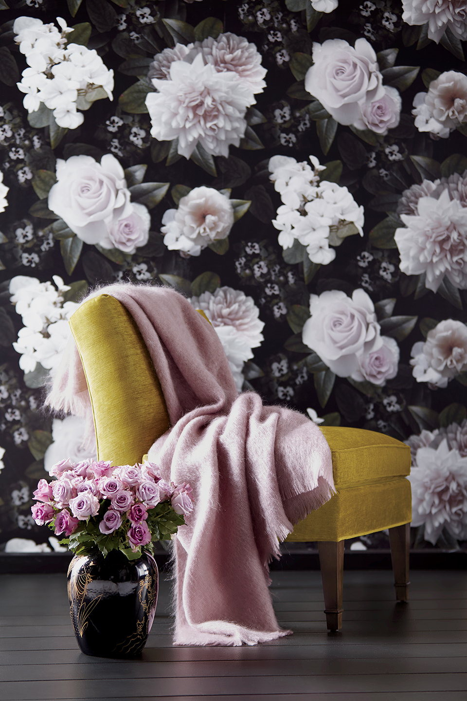
The brand encourages homeowners to experiment with the energizing shade, by using it as a complimentary color in the home’s entryway, living room, or bedroom. The red violet undertones will immediately catch the eye, and uplift one’s spirit, and surroundings.
Balanced Color Scheme
Use a well-balanced color scheme, such as a grey, neutral, or off-white tone to achieve harmony in your design, ensuring the Very Peri shade is used as a functional element, to define your product or space.
Pair With Soft Lighting
For homeowners or designers who wish to use Very Peri as a primary shade, adding a lighter shade to tone the look and reflect a softness may easily balance the room.
Combine with Saturated Colors
Combine Veri Peri with bold saturated colors for a vibrant pop! This electrifying color palette will allow the interior to stand out and turn heads. Try combining it with zesty lemon yellow or lime green for contrast.
Accessorize
When dressing an interior, use items that will accentuate a space and add a dash of color such as linen, a bed throw, and cushions, which will provide the room with a peaceful calmness.
Textiles
Textiles recommended to pair with Very Peri include cotton and light velvet, as it enhances the softness of the dominant shade.
Office Space
For an office space, bright lighting best compliments the color as one would extract an inspirational energy reflecting from the fresh, yet calm hue.
The DON’TS:
Dark Colors
Very Peri is a playful shade, avoid pairing this with dark colors and shades that may compete with its presence.
Avoid Going Peri Crazy
For the novice designer, Very Peri can easily add a pop of color to the look, but if you’re uncertain, avoid covering the entire room in the shade, and rather use it as an accent piece.
Avoid Harsh Lighting
In a commercial space such as a spa or salon, avoid installing bright lights that will draw harsh attention to the color. To softly enhance the blue hue, dim the lights to complement the color and immediately appreciate the organic, still atmosphere of the room.
Avoid Overpowering Commercial Space
Avoid crowding a commercial space with the shade, as Very Peri should as more of an accent color to instill either calmness or energy. Decide on the tone and environment you wish to communicate, which will then further enrich your design direction and color-use.
Lead designer of Ethan Allen UAE, Farah Attari shares her views on Very Peri, “When incorporating such a boldly, beautiful shade, the key to achieving balance is ensuring each element is in harmony with the next. I recommend pairing the modern shade with classic pieces such as the coveted Anderson Sofa or for a smaller piece the White orchid floral arrangement. Don’t be afraid to experiment with the shade by incorporating it in artwork, accessory pieces, and office spaces.”
As designers prepare to roll out the shade, homeowners may be sure to almost instantly want to incorporate this color into their homes, and office space to symbolize the spark of a new year, and fresh beginnings.